Portraiture is the theme of photography that includes a person or people in a picture often being the subject of the photo. There are many examples of portraiture such as , "the selfie" , self portraits (including paintings) and many other unique concepts created by individuals. We are studying portraits to understand the history of them , how they are taken and the variety of different categories of them. I find that portraiture can be interesting if there is effort or a story behind the pictures .
The first known photographic portraits

Robert Cornelius Self Portrait 1839
|

Hippolyte Bayard self portrait 1840
|
There is both similarities and differences between these photographs. For example both have a lack of colour or are discoloured since they are both taken many years ago. The quality of the photographs is also similar. However they have differences as well as similarities. For instance the first one is a picture of the photographer themselves but the other one is of someone else. Both of the images fall into the category of portraits, as it is a picture of someone. They are framed in which the person is in the centre of the picture. These images would have been taken with some of the first types of cameras. The backgrounds of the images are quite dull due to the quality but in the Bayard portrait there is some detail , such as it looks like there is a blanket on the man and a circular object behind him, maybe a hat. There is also different shades and colours in the Bayard portrait where as the Robert Cornelius portrait is mostly one colour. Since the photographs were taken in separate years, I think that has affected the colours because cameras had been slowly developing. The Robert Cornelius self portrait is just a picture of his head and shoulders because he had ran into the frame after removing the lens cap to be able to take the first "selfie". The Hippolyte Bayard self portrait is a picture of another man who was sadly dead. Robert Cornelius looks like he is from a wealthy background considering the clothes he is wearing. I prefer the second photograph purely because of the different shades and slightly more detail.
Environment Portraits
One of the first portraits I ever saw was a photograph of myself as a baby. It was taken by my parents and I was in a sandpit at the time in my garden. My grandma is in the background of the picture. The picture consists of many shades of green since i was in an area with lots of grass, trees and plants. The image was taken with a camera. If I were to describe the picture with 10 different words i would use : vibrant , natural , portrait , greenery , lively , sparkling , leafy , grassy , sandy , variety. Portraits have changed a lot since i first saw one , for example people take many more selfies than before and they are more creative. I like portraits where the person or face is not the main subject and it is in the background instead making it subtle.


This task was not easy but also not hard. It took a few minutes to find appropriate and fitting places to take the photos and also using the objects around us to help. I attempted to use the greenery around me to make the photos.
Recreating portraits

|

|
I found finding a picture hard that i could recreate. I tried to get the same angle and background of the photo so they could at least look slightly similar. However there are features of the photos that make them different. For example the shade of green on the leaves is quite different as the first ones leaves are much lighter and a more yellowish colour compared to the other which has a darker tone of green and the leaves a slightly bigger. The first picture also has a brick wall towards the bottom of it where as the other doesn’t. You can also notice the quality of them is slightly different because of the equipment that was used.
Environmental portraits part 2

|

|

|

|
Nico Froehlich
Some of his work:


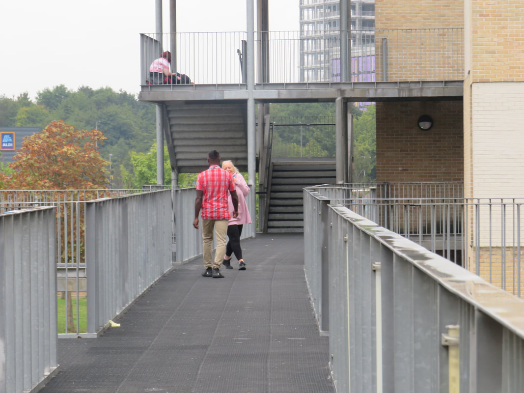
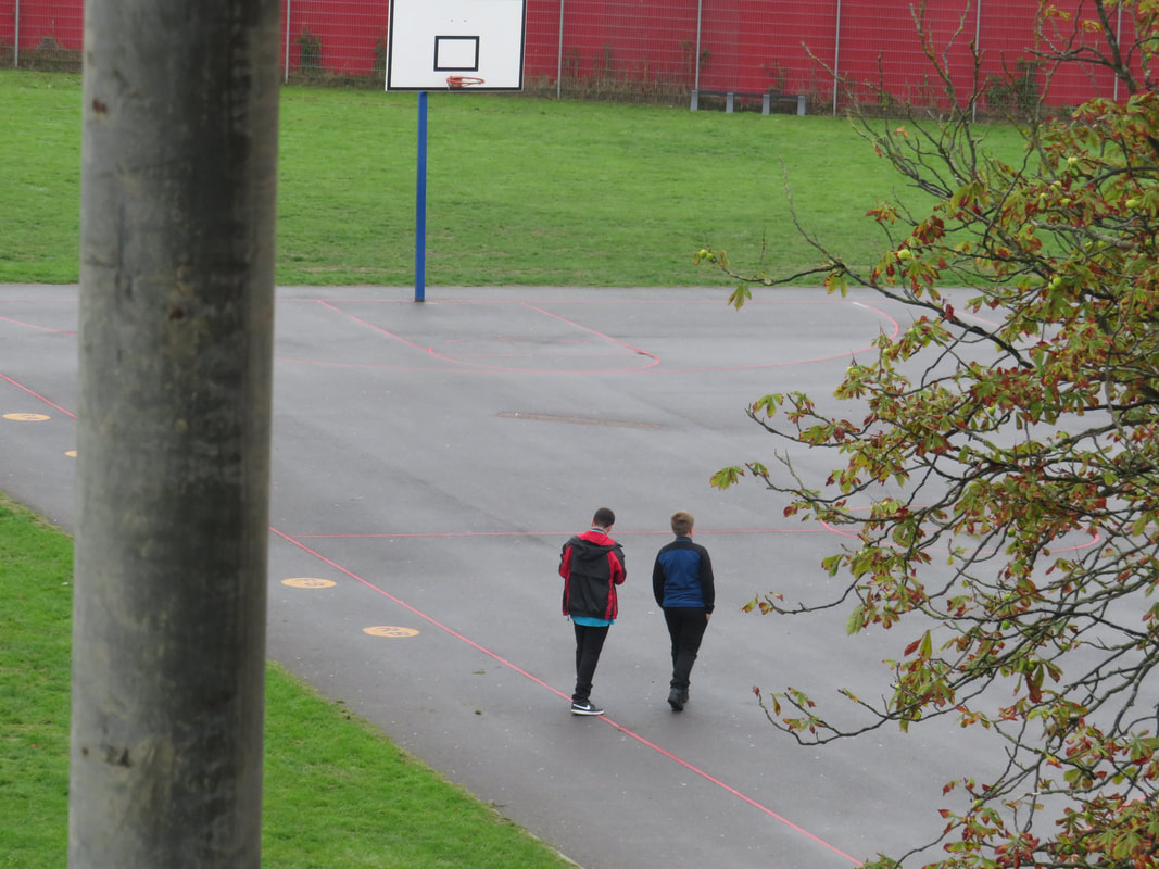
Nico Froelich is a British photographer born and raised in south east London. His photographs are based off his life growing up in the area as it is focused on the working class life and social realism of the place. He uses diversity and inclusivity. He took environment portraits of people in south London. He frames his images so the person or people are in the centre of the image. The background is important because it tells the story of the people in the area , another reason is that he would want to take a picture of the areas incase they have been removed or destroyed. He photographs everyday people who are strangers to him. In his portraits there is a lot of grey and brown since the area mainly consists of these colours.
Attempting to recreate his work:


This set of photos was inspired by the artist Nico Froelich. I used my local area like he did to create that community motivated feeling. I tried to use the sun to my advantage, utilising the shadows it created for me. The people in my images are mainly central like the people in Froelichs work.
Tyler Mitchell


Tyler Mitchells photographs are very unique and new to other photographers I have seen. For example he involves a variety of vibrant colours in his artwork, mainly in the backgrounds. His unique ideas were inspired by a trip to Cuba, a very colourful country, a consequence for his distinctive photography. Fashion also heavily influences his work. The images are from his youth and are recreated. His aim was to create images that no one had viewed before , denying history. He was the worlds first black photographer to take a picture for the Vogue cover. Mitchell grew up in Marietta , in Georgia. In the 9th grade of school he decided to buy a Canon camera and teach himself to create skateboarding videos. Tyler’s art introduces a new narrative towards the black beauty and embraces concepts from the past and creating imagined themes of the future. His work symbolises Black life and empowerment. His childhood in Georgia is also a heavy inspiration to the pastoral colours in his work. A lot of his work involves a sort of earthy colour palette , greens and browns.


In the photographs i attempted to take Tyler Mitchell inspired photographs. I made an effort to include certain features and aspects of his work. For example I tried to use the natural sunlight to create shadows and I utilised the colours in the background as his work is often quite colourful. I also used props. I found this task difficult to start with and as I progressed it became easier. My favourite one is of the picture where he is lying on the tennis table with the plant next to him. I like this one because of the shadow that the plant and the person make. I also like the light that is reflected onto him. However my least favourite is the one is the one where he stands next to the blue pole. I find this one a little basic and possibly not related or similar to Tyler Mitchells work. I maybe could have improved this one by adding more colour or being more creative with the backdrop.
Central London Gallery Visit


On the 14th of October I visited the Tyler Mitchell exhibition and the photographers gallery. I saw many different types of portraits. Some that caught my eye looked strange to me, especially the black and white ones. The black and white tone gave a gloomy and depressing mood to the photos. The locations where these photographs had been taken also added to the mood as many of them contain a thick fog in the background with many also taken in working class areas. I saw portraits that looked to be created centuries ago. The Tyler Mitchell photographs surprised me because some were far different to ones I had seen when I first saw his work. Many of Mitchells photographs were taken outside in the nature, again showing the theme of his photography using earth like colours.
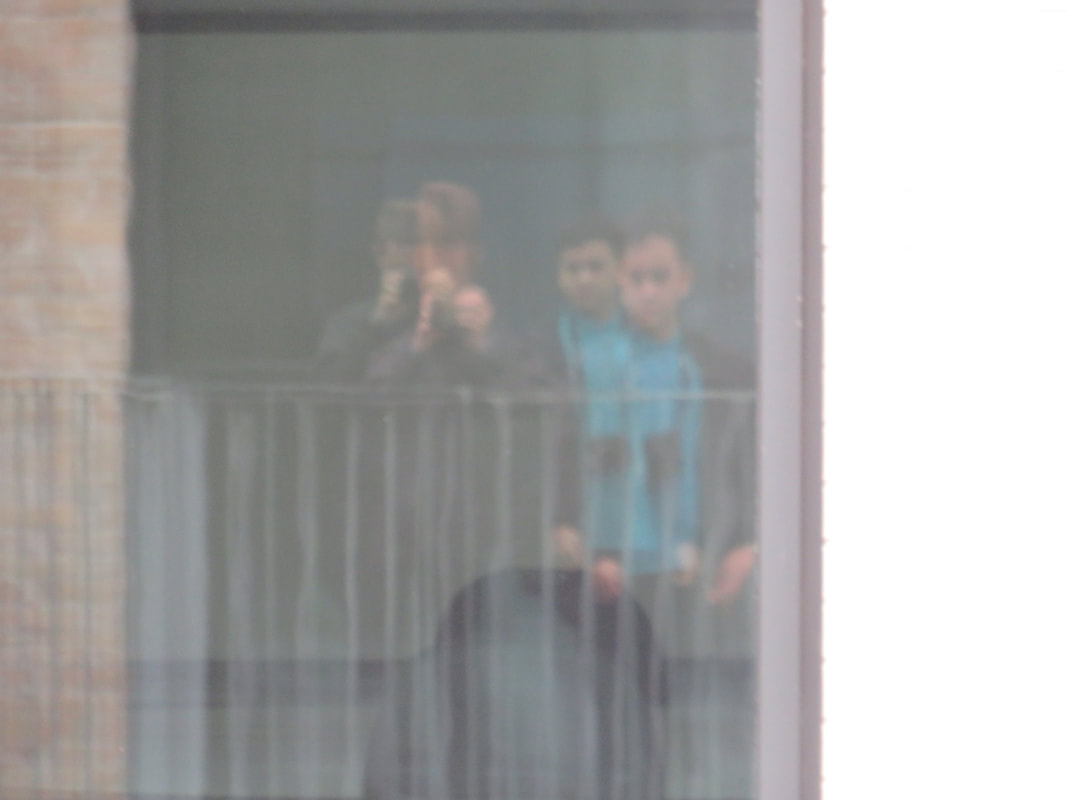
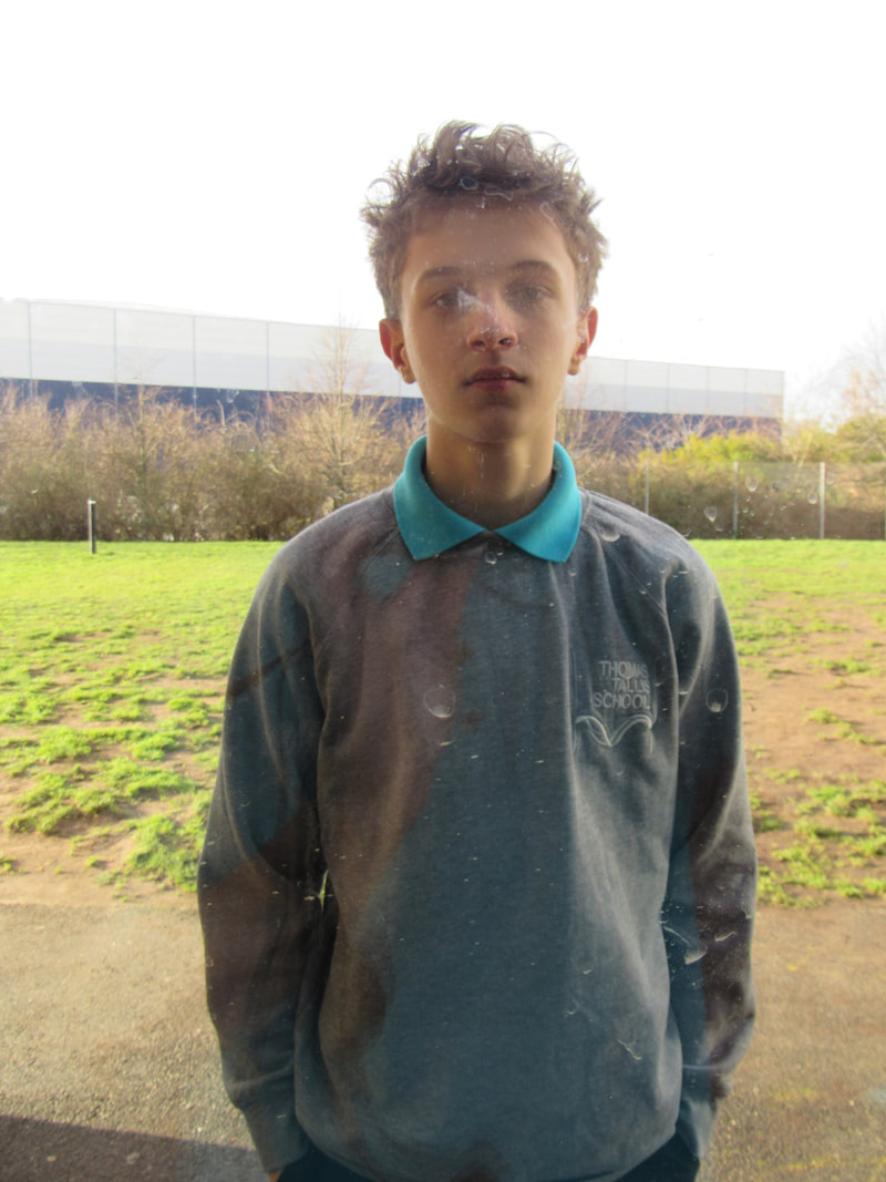
Self portraits


In this lesson took a series of portraits, looking at the different formal elements. These include line, shape , form , colour and light.I focused on light , line and interesting reflective surfaces. I mainly used windows in doors to create reflections and it also created distortion, which resulted in my favourite photo. I picked this one because it is the most unique out of them all. The reflection creates two people, one more faint and subtle than the other. Taking this particular portrait was a simple process compared to the others above. I also believe that this one is more detailed than the others with a lot more going on. I really admire the light in this picture as it creates many shadows in the picture. However the other ones i find more basic and simple compared to this. Because this one is more visually engaging and the form is a lot more interesting. The orange and blue photo that has been taken in the stairwell is probably my least favourite because it is a lot simpler in terms of reflection , lines and the light. It has a lack of contrast and appears to be flat. I could improve my least favourite photograph by adding more elements to it and add more to it than just a wall and a reflection.
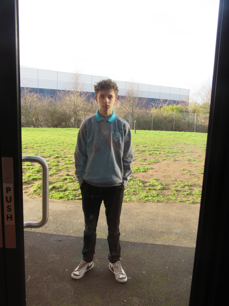
Elements of a portrait


In the this lesson we experimented with taking different types of portraits , which use different elements. For example angles , facial expressions , framing , poses.
For the first photo, "the mugshot" , I made the person look serious as mostly all mugshots have that facial expression, looking stern or grumpy. I took the photo from slightly below his face , showing more of his chin to symbolise confidence or cockiness. A typical mugshot.The second photo was a passport picture so i had a similar idea , a neutral expression but i took it closer to capture the features more closely.I also used a plain background in the photo as the main purpose of a passport photo is to look at the features and recognise someone quickly.The third photo was a regular self portrait so I took advantage of my surroundings and the sunlight. I included the body a bit more and it was taken further away to show clothing. The final photo was a family snapshot and I included myself since family snapshots have 2 or more people in. In most of the photos only the head and shoulders or the upper body can be visible, I did not choose to include the legs. Maybe in the family photograph I could have used more people in it , since there is only two in it.
Portraiture in art and photography


In this lesson I recreated portraiture artwork. I had access to props such as pieces of coloured cloth to help me create the photos. I attempted to use similar colours in my photograph like gold, blue, grey and white. I also used the same pose as the original , with the women pouring the jug. We took it near a window to get light onto his face, to improve this I would make sure there is no shadows. I would also take the image in a more suitable environment as the original picture is close to a corner and it is darker than mine. Taking the photo at a similar angle would also be more appropriate because they are facing opposite directions. I liked that I used similar colours for clothing and that I used a water bottle, improvising instead of a jug.
Recreating


In this lesson i attempted to recreate the photos from the previous lesson and improve them. Firstly I changed the direction he was facing to make this picture more similar to the original artwork. Then i experimented with the light created by the windows in the room. I eventually decided to use the corner of the room as it matched the original photo the most because it also looks to be in a corner. The light reflects onto the persons face, making a shadow behind him. I also tried to make the colours of the clothing more similar, using beige and blue.
Photograms - Gyorgy Kepes
A photogram is a photographic image made without a camera by placing objects directly onto the surface of a light-sensitive material such as photographic paper and then exposing it to light. Many photograms are taken in dark rooms as they are effective for taking these types of pictures.
An example of a famous Photogram artist could be Gyorgy Kepes. Some examples of his work:


In these particular photograms you are able to identify some objects use to create them. For example, a hand and glasses are used to make some of the photographs. The gradients in the photos are noticeable such as the 5th photo where the arms are used they are all not the same tone and brightness and fade away.
Kepes' photos are much different to the artist man ray as Ray's photograms include multiple different objects, taking up large amounts of space where as kepes has far more space in his photos and they are much simpler.
Examples of Man Ray:
Kepes' photos are much different to the artist man ray as Ray's photograms include multiple different objects, taking up large amounts of space where as kepes has far more space in his photos and they are much simpler.
Examples of Man Ray:


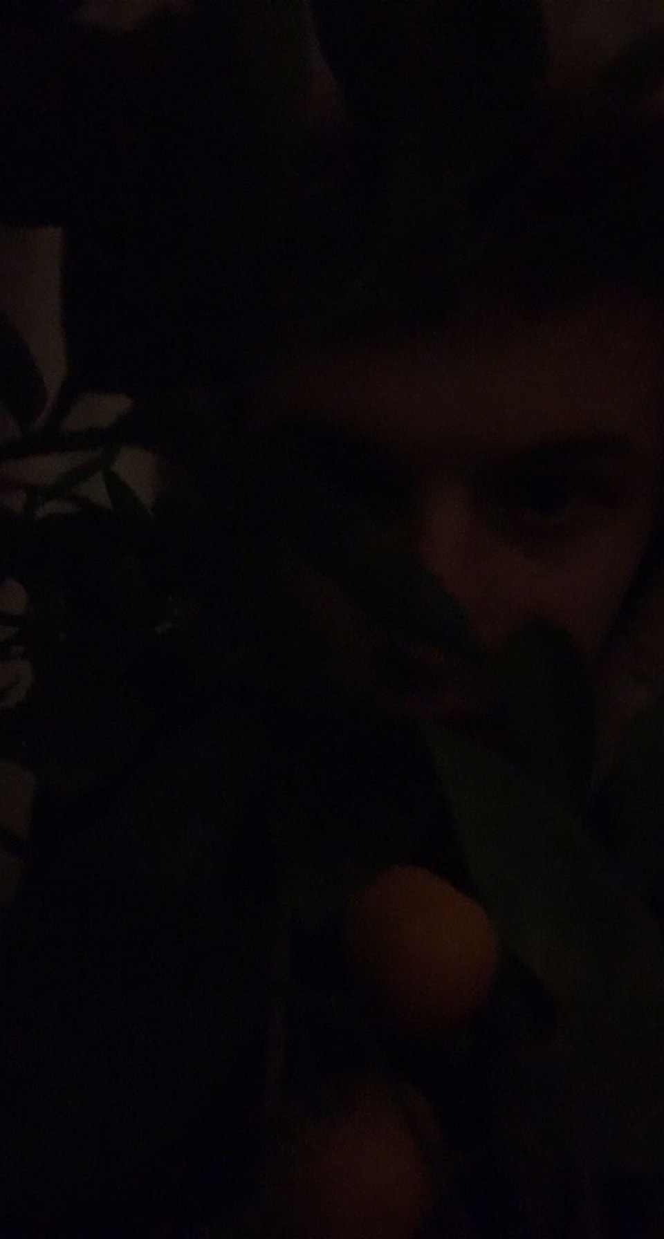
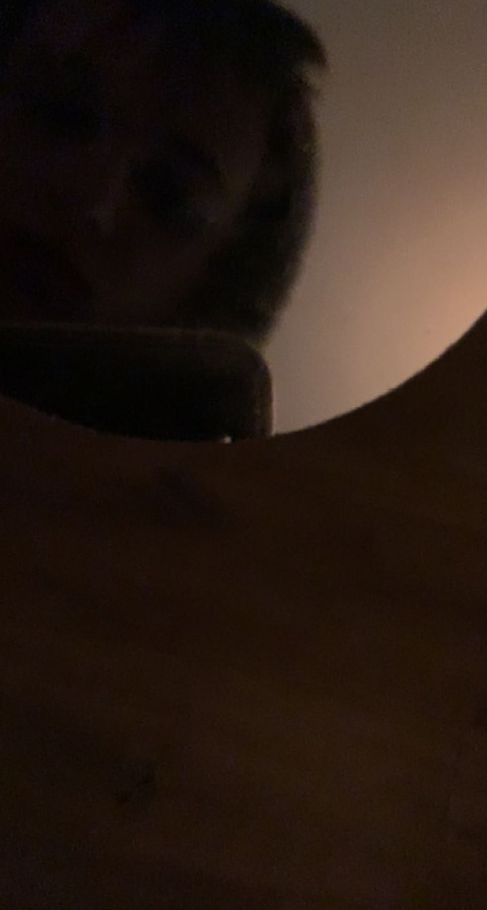
Six Unusual Self-Portraits
|
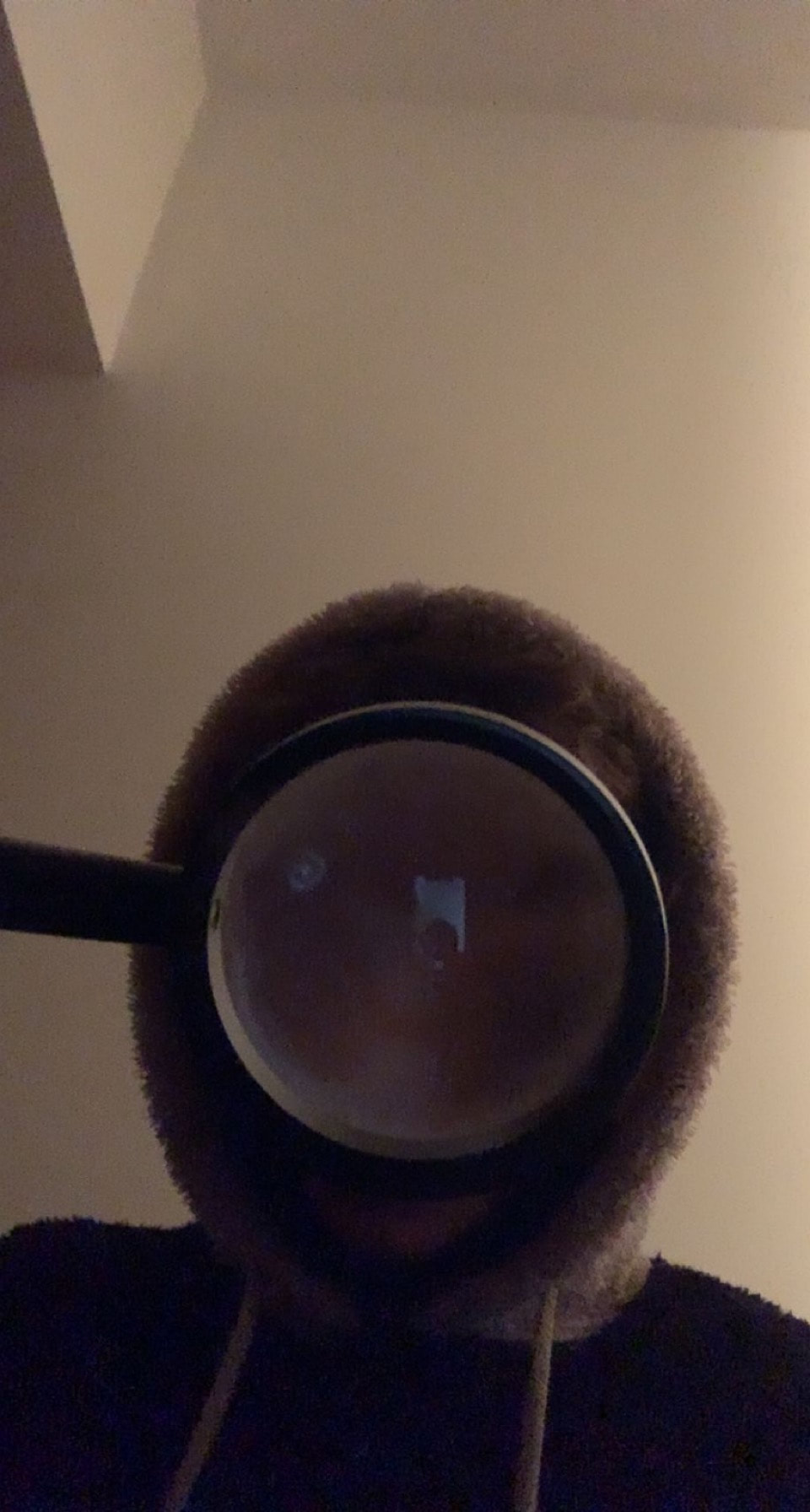
|
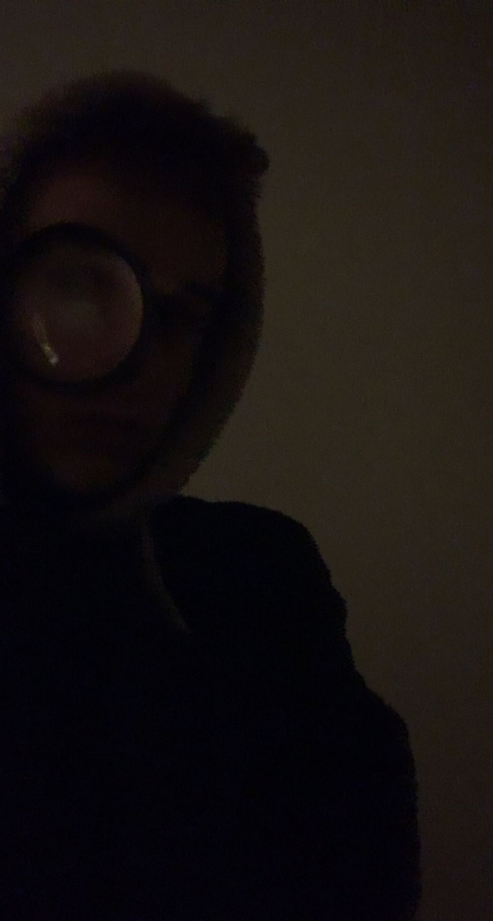
|
When I took these images it was dark. I used this to my advantage , creating this almost secretive aspect about them. I hid my face in all of them since it was dark. I like the last image of my reflection in the window because there is something strange and mysterious about it.
Lighting Workshop
In the workshop I learned that the softness of the light can be changed through a piece of material called diffusion. When covering the light with diffusion the light appears softer and less harsh. More than one diffusion can be added to a light. A bounce is a white material that is commonly used to reflect light in the direction you want it. The opposite of this is negative fill which is a black material to create shadows (or cut light). The intensity of the light can be changed by two buttons on the back. Many different shadows can be changed depending on the angle of the light. A soft box is a piece of equipment that confines light from an artificial source into a wired framed box. There are two different lights
Self Portraits
|
|
|
Helene Amouzou "Self Portrait"


Amouzou's portraits are unique compared to others. The subject of her photos is usually herself. However, she creates a sort of ghostly effect onto herself giving the photos a slightly uneasy creepy mood. In some cases her dress is similar to the wallpaper, this makes herself almost camouflaged into the backgrounds. Furthermore, the background also supports the chilling mood. For example , the walls are stained and the wallpaper is peeling off. This consequence of the background produces the image of a derelict and haunted house supporting the mood of the photo.
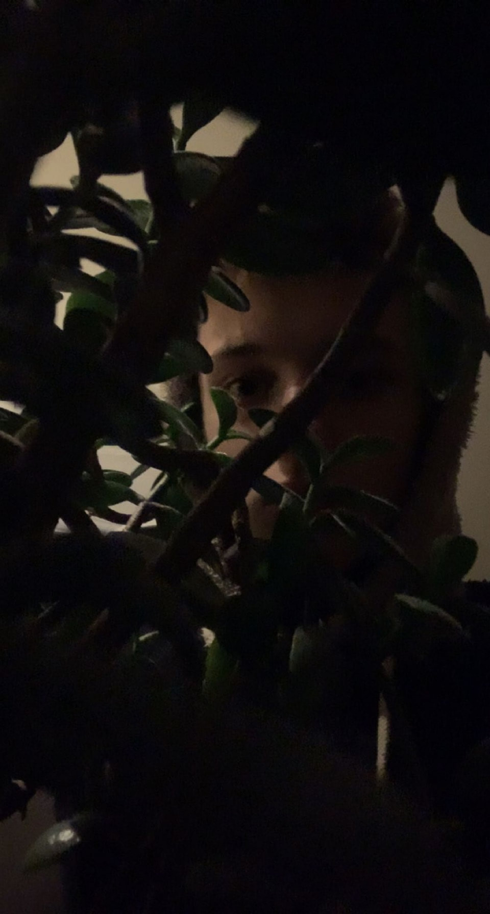
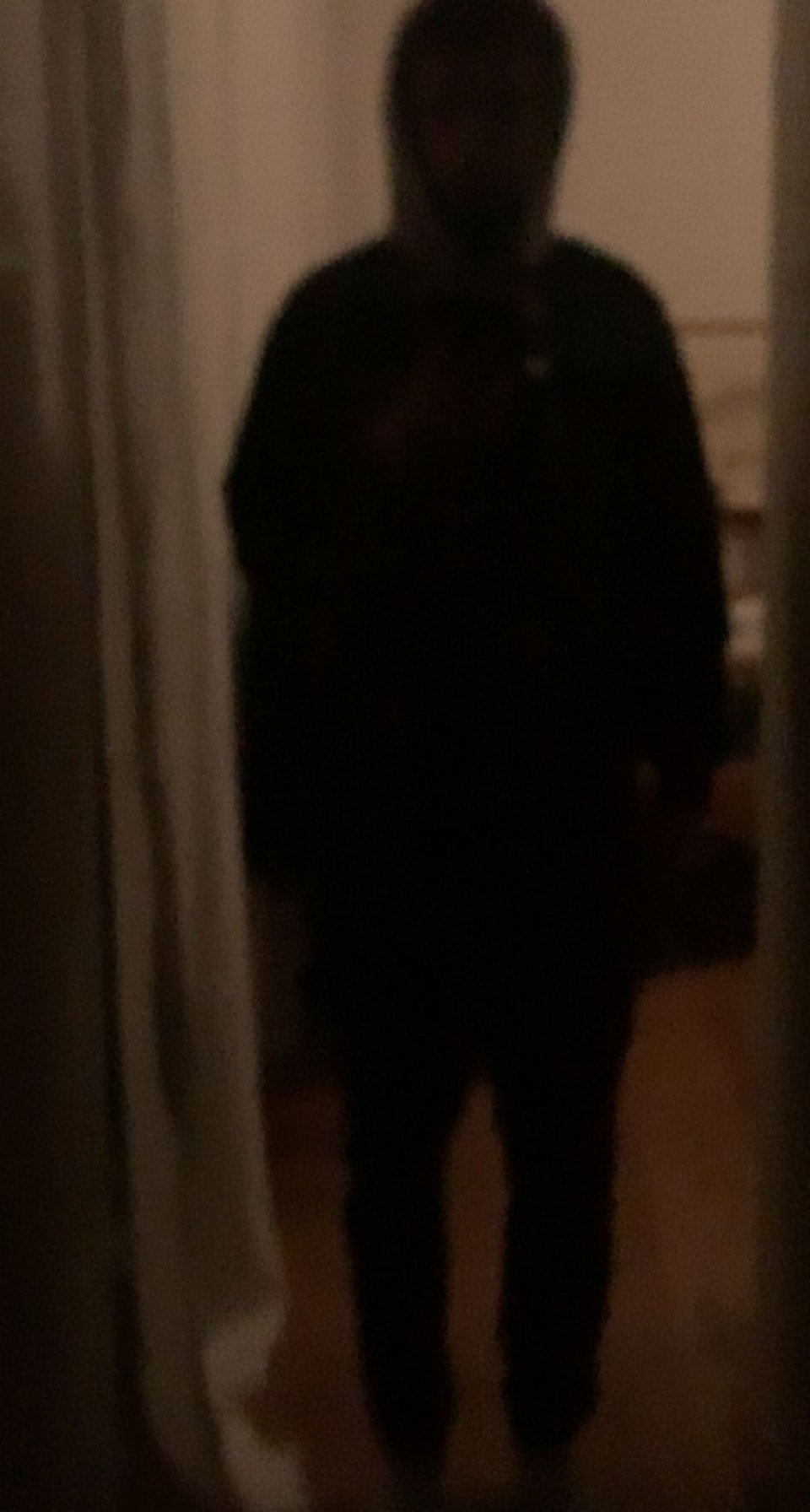
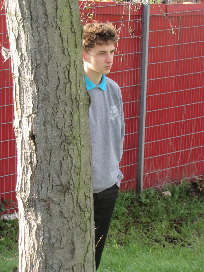
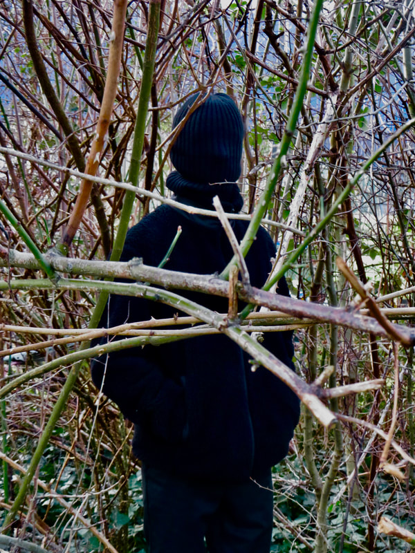
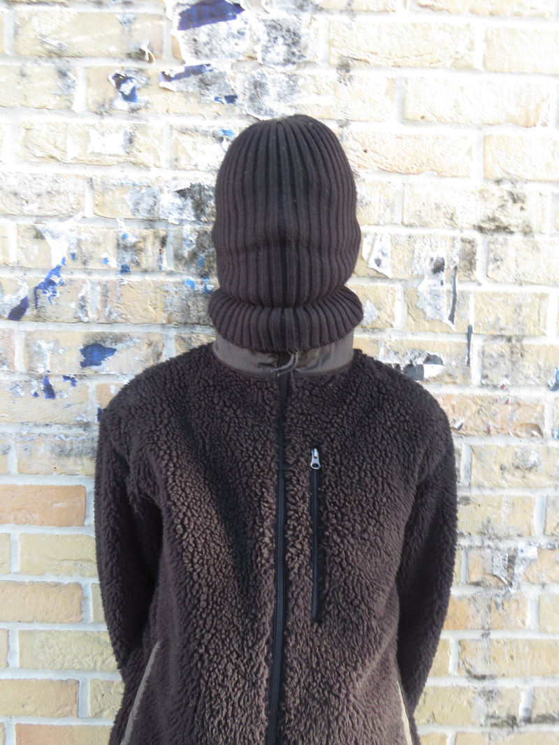
Final Portraits
|
|
|
In these photos I tried to hide my face as i wanted to try something new. I used my hat to cover my face. However i think I could have been more creative with the others apart from the first as they are just pictures of my up against a wall. On the other hand the first photograph is by far my favourite. I like the way the branches cover parts of my body and hide me in the bush. I think its very effective. I also used photoshop to edit the photo.
Rankin Destroy


Rankin is a photographer who takes photos and then destroys them. He gathered 70 different musicians and visual artists and took pictures of all of them. However, afterwards he asked them to destroy their own pictures. Rankin said "I was keen to encourage my students to create proficient studio portraits, considering a range of technical issues, before destroying them, thinking about the particular strategies they might use to add other layers of meaning." He used this idea to reply to the criticism he receives.
Rankin Destroy Inspired Work
|
|
|
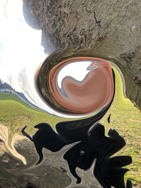
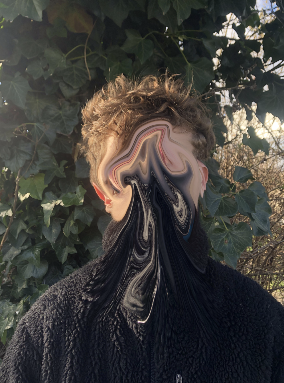
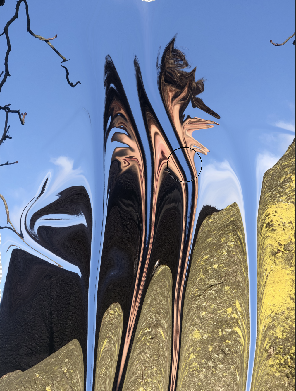
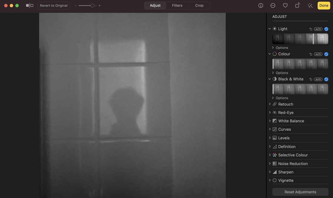
To create these photographs I used a website called photopea. I attempted to use the tool called "Liquifyer" in order to destroy the pictures. I used this process because it could easily change my photos. I think the wavy unnatural aspect of this photos is effective and gives of a trippy vibe. The pictures are dream like and abnormal. However the colours in the photos are not particularly appealing , I find they are quite basic and naturalistic colours that contrast with the irregular aspect and filter.
Rankin destroy continued

|

|
This lesson I also used the pictures and made colour scans , as shown above. In the process I cut a printed version of my photo into multiple pieces and placed them irregularly onto the printer creating these misshapen pictures. In my opinion , the first photograph appears less effective than the second because of the various white patches. Despite it being an attempt to "destroy" the photograph, it doesn’t seem very appealing to me. However I do prefer the colours of the first photograph to the second as the darker colours I find are more pleasing and interesting. People may ask or question what this photo had looked like before if they saw it because of how you can still see remaining parts of the photo. I think the blueish and purple colours are a large factor in remembering these photos. I have learned that you can destroy photographs and still make them look good.
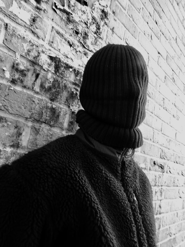
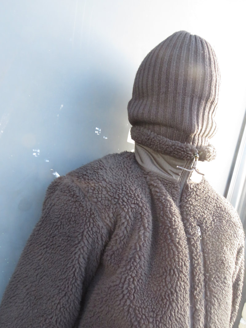
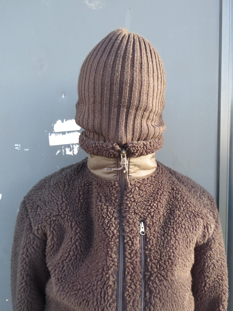
Lee Friedlander


Lee Friedlander is an American photographer who takes unusual self portraits. In most of his photographs he attempts to cover his face. He uses a black and white style which I think creates a dark mood to the pictures. The most interesting part of his photos are


In these photographs ,I like the fact that I used black and white for only some of them even if Friedlanders are all in black and white. I think it gives variety to the 30 photographs because you can see the difference the colour makes in some. I used his style and implemented it into my pictures. However I did not completely copy his photos, I tried to make them my own. I enjoyed trying the shadow technique he used in some of his work. I think I could improve these by making the location more diverse rather than just taking them at home.
Zinqianqian


The basic aspect of these photos is , in my opinion, the most effective. The simpleness about the pictures is quite powerful. However I find the colours slightly bland or boring despite these pictures being simple. I like the use of flowers and plants consistently used throughout the photos. And also the mirrors. I believe other people would say this too as these are the main focus points of these photos. I think the fact that she does not show her face is something worth remembering about them.
My own attempts


In my view I do not necessarily like this batch of photos. They are certainly not similar to the artist's ones. Although I do like the objects I used. For example, I like the pink flowers I used because they are different to the boring green plants so they add colour. Much like the oranges. I tried to used a plain , one colour background in attempts to make my photos somewhat alike. I believe I should have given some variation in the photos. For instance I could have used more or different mirrors rather than a singular one at separate positions.


Editing photos


I used photo editor to edit my past images. They look more effective in black and white rather than colour. My intention was to make black and white photos similar to other photographers, e.g Lee Friedlander. I wanted to edit the images so they appeared in the dark black and white tone. I used my phone in these photos and used my shadows and reflection around my house. I used the technique to hide my face or not su]how it completely. I think this makes the images more mysterious and secretive because my face is unable to be seen. My next task will be to print these on see through paper. These images are still related to portraiture as it still includes me.


Title display idea