When encountering the natural world I normally feel at ease, a stress free feeling. There are many places to see landscapes but the most common would be on a mountain or hill. I wide view of the landscape around you. People take pictures of nature perhaps to feel peace or admire the silence around them. Maybe people do it to find something unique in the landscape. Photographs are able to change our perspectives of things. For example the photograph could have a variety of filters applied to it. Perhaps if it was in black and white it would change the whole mood of the photo.
When i hear the word "landscape" I see a green fields with large trees and a clear sky in the back of my mind. Words that I would associate with landscape are earthy ,vibrant, naturism, sky, green , grey , blue , sea , sun , clouds , mountain , sunset. When I searched "landscape" many images with mountains with sunsets appeared. My ideal landscape would be something urban related as I enjoy architecture of cities and their futuristic. The landscape pictures I have take are always usually of forests or sunsets as this is the most unique
When i hear the word "landscape" I see a green fields with large trees and a clear sky in the back of my mind. Words that I would associate with landscape are earthy ,vibrant, naturism, sky, green , grey , blue , sea , sun , clouds , mountain , sunset. When I searched "landscape" many images with mountains with sunsets appeared. My ideal landscape would be something urban related as I enjoy architecture of cities and their futuristic. The landscape pictures I have take are always usually of forests or sunsets as this is the most unique


In these images I attempted to use my local area mostly as this was the most useful recourse for me. Most of the images look similar , consisting of a common blue and cloudy sky with blocks of flats in a park. Some of these are my "ideal" landscape, for example the ones that include the ocean and mountains are my personal favourites. I much prefer cityscapes as I enjoy the more dark toned mood of them, especially at night.
The Idea of Landscape


the artist has chosen to include quite basic backgrounds, mainly similar colours. The landscapes may have personal meaning to the artists. In the first picture we are relatively close to the landscape. However in the second one it seems as it has been zoomed in and cropped suggesting it may have been further away. The choices of the first photograph communicate a lonely and eerie mood because of the black and white tone and emptiness in the landscape. On the other hand the second photograph involves more action, picturing a man on a horse. The picture was taking during motion making it more lively than the first. The brighter colours also back up this mood.
Minamalist Landscapes: What Remains

Geraldo de Barros - from the series Sobras , 1996
|

Liz Nielsen - Gardening with You , 2020 , Photogram
|
Geraldo de Barros was a Brazilian photographer and artist. He focused on abstract photography and used methods such as pinhole photography, solarisation, exposure and more. On the other hand, Liz Nielsen, an American photographer uses techniques such as negatives and found light sources to produce her work. I can see that both photos are nature related however they both lack colour and are perhaps basic and not very detailed. I find the fact that a picture of a tree is stuck on plain black paper is unusual. The detail of the tree contrasts with the blankness of the background. Liz Nielsens photo depicts a garden , I find it surprising that I was able to recognise what the picture was despite there being a lack of detail. When I look at these pictures I struggle to identify any particular emotions that I feel. Perhaps the first makes me feel glum or gloomy due to the black and white tone of the tree. Attempting to make pictures like these would be easy , only needing scissors paper and glue. I believe the artists have removed the landscapes of these pictures so you focus on the tree or plant instead. I prefer the first photo because it is less basic than the other.

Photograms


Today I went in the darkroom to use the asatapes of the landscape pictures. I made two different photograms of landscapes I took myself. These were inspired geraldo de barros and liz nielsen as they both lack detail similar to the photos above. I think the way the outlines of the shapes smudge into the black background is effective.
Centre of British Photography Trip documentation


On the 14th of July I visited the Centre of British Photography. The main theme was based on landscapes, however there were others types of photo as well. For example some portraits were includes and still life photographs. I enjoyed a variety of the photos displayed in the exhibition. I had seen a new perspective of the landscape genre such as how a portrait can also be included in a landscape type image or perhaps the use of photoshop and its affect on the picture. I also liked the lighting in this building as it was different on all 3 floors, creating a difference of mood for each gallery of photos. For example darker themed pictures were supported by the dimly lit basement floor. I was drawn to the photographs in the entrance floor as I admired the first impression it gave. I noticed how some of the landscape pictures on the first floor had grey skies, similar to the one on that day. While other landscapes in other photos seemed awfully familiar even if you hadn’t been there before.
Hiroshi Sugimoto


Despite the blurry aspect of the photographs of Hiroshi Sugimoto, there is still clear outlines of the buildings he has photographed. I am still able to identify some of the buildings or at least imagine what they would look like normally. I think the colour is effective about these photographs as well as the obvious blur. The blur and black and white tone create a sort of uncertainty and mysteriousness to the photo. I believe that there is no clear things that do not work well as i personally really like this style. I think other people would also get this gloomy and dusky vibe from the pictures because as there is a lack of detail the photos do not have a lot to tell clearly. This supports the idea of uncertainty. The most memorable features of these photos are of course the dark outlines of the buildings involved. The dark tone of them separate them from the lighter sky.


Here I attempted to recreate the Hiroshi blurry photographs. At first I struggled to get the photos to blur but once I learnt I found it easy to take them. I matched the black and white tone of the photos by editing them. The camera position alternated throughout the photos as I tried to get more of the building in the picture. I believe the photographs did achieve its original purpose as they are mostly similar to the Hiroshi photographs. However I feel that perhaps the photos should have been less detailed.

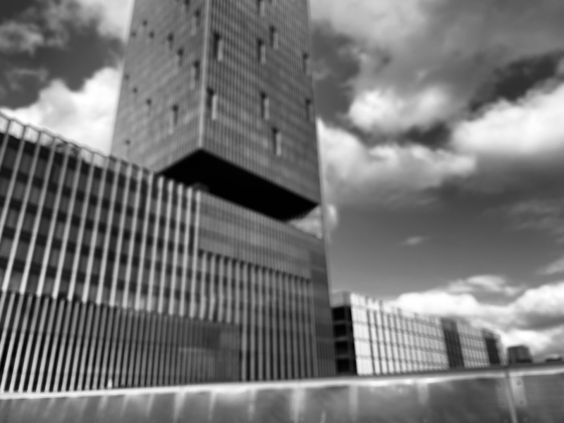


These blur photos were both inspired by Hiroshi Sugimoto and Bill Armstrong. The black and white based ones were more inspired by Sugimoto as they consist more of towers and city like landscapes. On the other hand the coloured ones are inspired by Bill Armstrong. These involve more greenery than urban aspects. Hill Armstrong focuses on colour a lot in his burred photographs. I Edited all of these to change the tone, the black and white using the noir tone and the coloured with the vivid warm filter on my phone.
Diptychs


In this experiment I used the app "Freeform" on my phone and added two different photos from the work above and put them side by side. I think the line between each photograph is effective as it sort of blends each of them together. This is especially effective if you squint your eyes. However this does not apply for every photo as some do not work as well together.

In this exercise I printed one of my dyptychs out and I have outlined the clear shapes in this photograph.
Back to the Future


|
This picture describes a more rough ocean/seaside landscape. There are similarities between the photos such as they both depict seaside. This photo is different as it has not been altered the same way the other has, perhaps maybe the colour or tone has been changed. Words I would use to describe this landscape would be: Oddly familiar , uncanny , unwelcoming , unsettling and slightly creepy. I feel this way about the picture because of the vivid black and white tone that makes the picture look old and taken a long time ago. The large black building seems unsettling and not inviting to me due to its dark nature in the photograph. I would prefer not to live in this landscape as the sea looks more aggressive and there is a rocky edge to it.
|
This picture depicts an ocean landscape that is torn up into different shapes and placed in an irregular way. This photograph also is of the ocean. However, colours play a role in this picture but the other is only in black and white. Words I would use to describe this landscape would be: unusual , unrecognisable , mysterious , strange , unique , irregular. I have chosen these words as I do not see many landscapes shown in this way. It seems the artist has cut up the photograph in a way that it is almost unknown to the viewer what the picture is about, except of course the disguised cut outs of sea and sand. The most I know is that it is a beach. I would prefer to live in this landscape as the sea looks calm and the sand soft.
|
Click to set custom HTML
|
|
Dafna Talmor is interested in a notion of utopian space.She attempts to create a space that doesn’t exist but looks and feels like reality, almost like a dream land. She does this by embedding multiple cutouts of different perspectives of a general landscape in one photograph. However in my landscapes I will add overlapping colour instead of different versions of the area.
|
Slides


In this lesson I created images to put on slides. I used my blurred cityscape photos and somewhat distorted them or changed them slightly. I scratched the asatapes with a sharp tool and stuck different coloured transparent plastics. I believe some photos went well. However I could have made the photos better by perhaps placing the coloured paper in a more regular way that fits with the lines of the photo. These decisions made in my opinion a bad outcome. Nevertheless I do like the tone and lighting of the slides and how it made the pictures turn out as if they were taken with an old camera. The blurred quality of the pictures supports this idea.


Half of these photos are dedicated to a landscape and the others a particular part of one. I focused on specific objects in a landscape and made them the subject of the photo while including the landscape with it. I think I could have added a bit more variety to the photographs as they are just one location. Perhaps I also could have applied different filters to them to make them less boring.
Dionne Lee
|
Drafts from Dionne Lee on Vimeo. My version |
In this video The artist uses a series of landscape pictures that seen to be taken from a magazine. She proceeds to tear certain pieces of the picture mainly in half and make a collage with the others. At first impression I was rather confused and found the concept of the video quite meaningless and boring. However, on second watch I thought the time-lapse collage was moreover interesting and unique to artwork I have seen before. The pointlessness and the fact the images resemble close to no similarities to each-other (apart from being landscapes), make the video different and special.
In this experiment I attempted to create a similar video to dionne lee.
I printed out and used some my landscape photographs and began to rip them up. I still find this idea strange but I believe it is supposed to make you feel this way. I had no plan for this process and just took any image and began to destroy it mindlessly. |
Mandy Williams


Mandy Williams named these photos "Disrupted Landscapes", she says it "explores the exclusionary politics of contemporary England through the metaphor of landscape" and she attempts to "disrupt traditional representations of landscape ". She took pictures in black and white and and then in a way separated them with what is most likely photoshop. I really like the solid black/white lines or shapes that divide these landscapes. Most of these are taken at eye level however they can alter to a waist or elevated level. The angle of view also differentiates from wide, normal and narrow. The wider ones consist mostly of a flat landscape but the more narrow ones are more mountain peak type of pictures. The orientations vary as well, landscape and portrait. This genre of her pictures shows rocky, jagged landscapes accompanied by a black and white tone. The pictures are quite formal, however are quite irregularly separated. The images are mostly naturally based but there are some abstract aspects to them, for example the shapes involved.

|
In this particular image there is multiple photos combined. Mandy Williams took several "traditional" landscapes and cropped and combined them. This photo has an unidentifiable camera composition as the images used are cropped in a way so that it is unknowable of the angle of view. The effect of the grey tone gives the idea that the photos look as if they were taken out of space- the moon?. The black shapes separate the images even when they are combined in a collage.
|


These photos were inspired by Mandy Williams but without the photoshop. I was not exposed to mountainous landscapes so I improvised with more natural landscapes in a park. I like the black and white tone that I edited the photographs with as it gives a misty vibe to them. I believe I could have made these slightly better by making them have more variety as it is mostly tree-based landscapes. Most of these were taken at eye level but some were taken at ground level as I tried to also involve aspects like the hedges or the walls.
Experiment 1


I attempted to experiment with with older photos from my blurred constructed landscape works. I used inspiration from the Mandy Williams Disrupted Landscapes. Some photos are quite similar but some also differ. I split one of the photographs similar to Mandy Williams and also used her technique of using basic shapes to separate and combine the landscapes. Some aspects went well, such as the use of the rectangular shapes and the combinations of multiple photos. However there is still room for improvement. For example some photos were carelessly chosen and don’t work well together. Moreover this was still an experiment and was not expected to go particularly well.


In these images I experimented with colour and filter. I used a more black and white filter for the cityscapes as I believe they suit this style better. However in the more natural landscapes I tested out different filters. I believe the blurry photographs went well for me. They give an ominous feeling and a sense of mystery. In contrast the more vibrant set creates a more refreshing mood, the bright orange and greens jump intrigue you and jump out from the picture. I think these could have been better if I experimented with the night sky (or sunsets) as well as day time. It could have given these more variety.
Slides Experiment


|
|
This is a video of the slides above. I put a black and white filter over the video as the slides came out a yellowish colour. The yellowish colour was not what I expected and wanted to come out as I would like this to be similar to the work of Mandy William’s Disrupted landscapes. The sellotape that is put over the asatapes creates a grainy look to the slides. It makes the slideshow feel almost old-fashioned as if it was made a long time ago.
|
Final Piece
To create my final piece I used heavy inspiration from the artist Mandy Williams which I explored previously. However I also made them my own images by using colour as well as black and white. I explored the theme "Disrupted Landscapes" similar to this artist. This theme interested me a lot as it explored the breaking up of landscapes with regular shapes and different techniques such as the slides I have used. It also explores the multiple perspectives of a place and landscape. I showed this by combining different pictures together that either contrast or complement each other. I really enjoy the grainy effect the cello tape adds to the slides , as at first it was unwanted and unexpected but then I used it to my advantage and integrated it into my piece. Most images went well in this video. I really like the effect the cello-tape has on the slides. I used the black paper on the slides similar to the black shapes Mandy williams had used on her Disrupted Landscapes. However, some images turned out worse than I expected as the black paper did not work well with the light and shadows around it. I placed different images over each-other on the slides to create a distorted effect. I developed this piece by adding even more slides than previously. It amounted to about 30 slides which is almost 5 times the amount I had before.
I chose the decision to go with slides as it worked well with my inspiration from Mandy Williams and my own work. I originally was going to use just black and white images. However I decided to use coloured ones as well as it provided a variation in my images. Just black and white would be bland and dull. I found creating the slides most challenging because they were difficult to stick together as they were small and thin.
I have used my website to show my original ideas before. It showed the limited amount of slides I had at the time and how I have developed my idea for this outcome.
I think I have successfully explored the theme of constructed landscapes successfully, showing my multiple pieces of different artists and perspectives of constructed landscapes. This final piece was what I had in mind and it worked out relatively well for me. This work is personal to me as most images were taken when I was out with family, such as in the places like Greenwich.
