|
|
|
|
Places and spaces
I chose places and spaces because I am interested and admire landscapes, particularly the urban kind. I admire many sorts of architecture and enjoy photographing it. I am intrigued by many artists in this topic such as, Sebastian Weiss who captures unique and abstract shapes in architecture from a range of camera perspectives. Furthermore, Candida Hofer another example of a photographer in this section. She photographs interior spaces of building that include museum, libraries, etc. I take care to notice the shapes in everyday architecture and landscapes.
Artist Research- Nicholas Goodden
Some of his work:


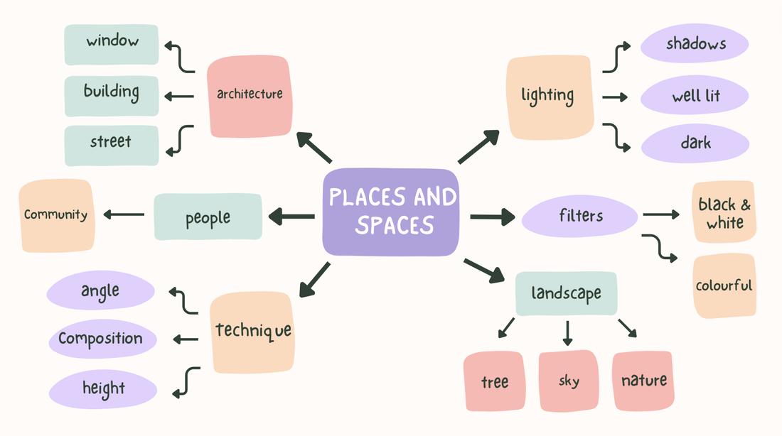
Nicholas Goodden is a London based street photographer. Nicholas claims "Street photography is a genre in which you have little to no control of what your subject does, the light you’re working with, or the setting." A majority of his street photographs picture settings with motion and movement such a the blur and lights from cars in time lapses. The colours in his street photography vary from black and white to more colourful urban landscapes.
Single image evaluation

|
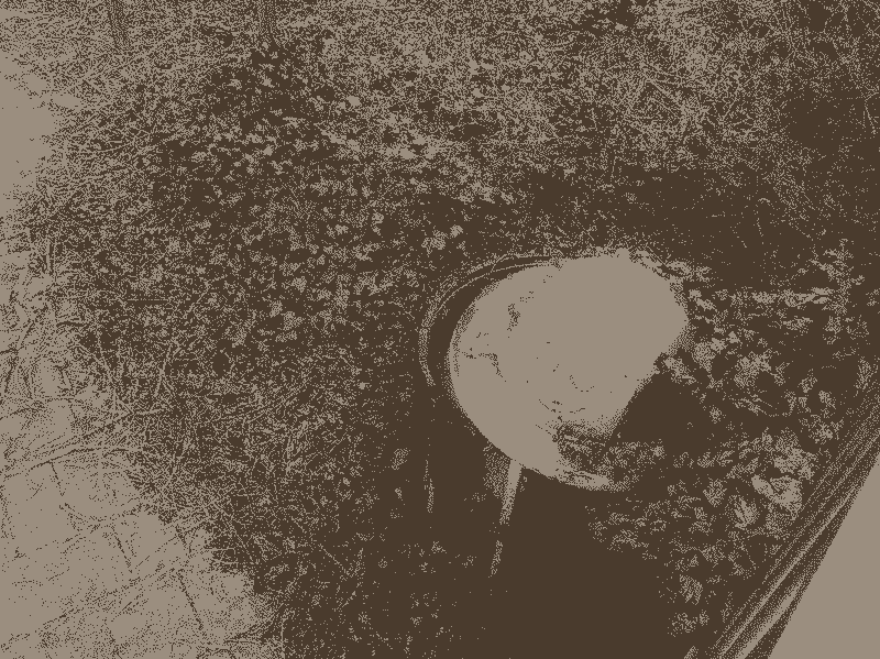
The graffiti in this photograph is the most effective feature in my opinion as it is the first thing I noticed when looking at it. The big font of the graffiti really takes your central focus towards it , standing out to the rest of the picture. This is a naturalistic image as it focuses on the space and landscape. However, there is an abstract aspect to it because of the edited image over the river. Apart from the graffiti, the leading lines of the river also drag your focus to the distance. There is varied colour in this photograph. However, it mainly focuses on the grey and blue of the sky and foreground. Space is quite open in this picture, the pavement around the river and the river itself provide a vast area of space in the photograph.
|


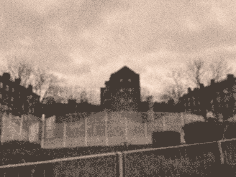
Here are pictures created with inspiration of Nicholas Goodden. His images include more colours then mine and are more vibrant. I was aiming to capture a street photography mood similar to goodden but also making it my own at the same time.
Experimental Work


In this experiment I tested out different colours and filters. I mainly used the blur filter as I found it interesting to mix with overlapping the same image over the original. It reminds me of an album cover.
The Processes


Here are further inspired photos from Nicholas Goodden. I believe these turned out far better as they create a better street photography vibe than the first set.
Experiments 2


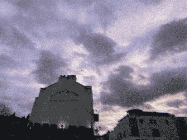
Here I experimented with features such as the 3d filter. This led to the futuristic black and green looking photograph. This filter creates a more serious mood to this photo than the original. I also experimented with the blur filter in the top one.
Sebastian Weiss


Sebastian Weiss is a photographer who focuses on the architectural side of urban landscapes and spaces. Many of the pictures he takes involve a sort of abstract way of architecture of buildings. Light is effectively used in these photographs as they seem to also be taken during the daytime, allowing shadows to sculpture the buildings in notional forms. The building compositions are centre dominant mainly and camera angle taken from ground level looking upwards at the buildings.

|
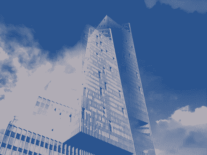
The Pattern on the building is the most effective feature of this photo. The unusual design of the building attracts the focus of the audience to the centre. The soft white colour contrasts with the black abstract pattern of architecture. However, the blue sky complements the white colour of the building as they are both lighter colours. The architecture looks as if it was photoshopped. The shot is taken from ground level looking up to the building which only captures the sky and the architecture itself. This takes the focus away from the surface as it is not visible.
|


I used inspiration from Weiss' architectural photos and applied it to my own. There are similarities and differences. The colours used are similar, for example the sky blues and whites. However the colour of buildings in mine are far more varied compared to sebastian's as he mainly uses an off-white colour. There is less simplicity in my photographs as the architecture and buildings are more detailed and complex. Additionally, I did attempt to use his camera angle by looking upwards at the building and mainly centring it in the picture.
Further Experiments


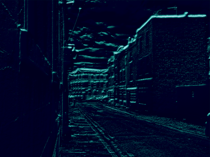
These are my experimentations with photoshop. I used a range of different techniques , filters and tools to create this gallery of multicoloured photographs. For example, I used the crystallise tool to distort some of the images. I liked how they turned out as they look like paintings depending on how much I distorted it. Furthermore, I also used the mosaic filter to edit some of these images. It gave them the pixelated feeling they have. Additionally, I layered the same images on top of each other to provide dimensions to the picture. Some images contrast the smaller image layered over it but some complement each other.
Book Layout

This is my layout for my book. Some images have similar colour schemes and complement each other well but there is also some that contrast each other. Such as the coloured and the black and white.
Here I used my edited images on photoshop to create a book. I changed the colour of some pictures to add more pages and give more density and variety to the book. Some images contrast each other throughout the book. For example the colour and tone. However some images also complement each other. Perhaps I could have added more images or even more completely different ones, adding even more diversity to the piece.
Gif Experiment


Here I attempted to bring my photos to life by creating a gif. I distorted the images by combining them together to create an overlapping effect. I prefer the second one due to its overlapping black and white pattern. The effect makes the image warped. However, I don’t like how both images cut off abruptly and the gif doesn’t flow properly.
|
|
|


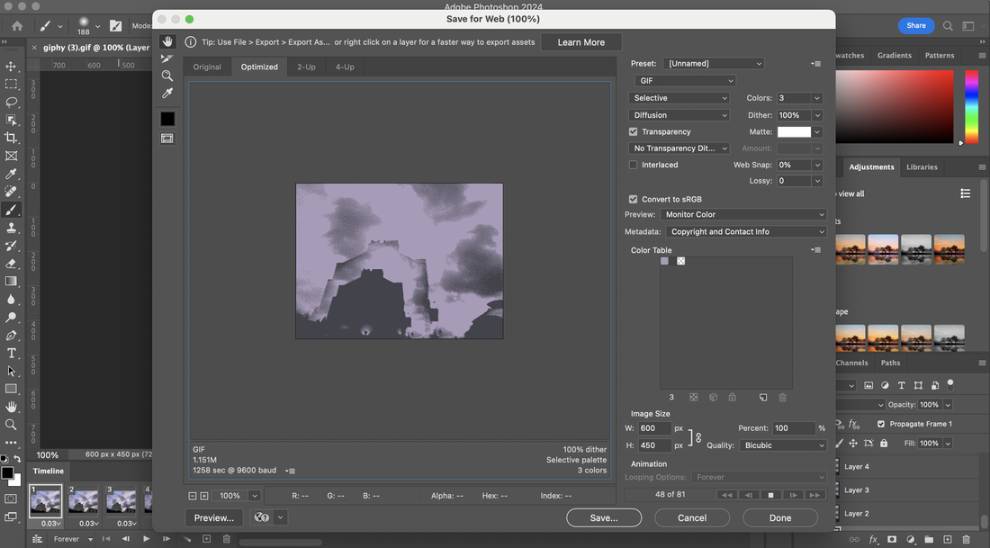
This is my second attempt at producing gifs. I felt they went far smoother and I was able to make them into actual gifs rather than just a video. I used the timeline feature on photoshop to make aspects of the picture move. I had to reduce the quality of some of the gifs to be able to put them on here. However , this turned out well as it meant that the amount of colours in the gif had to be reduced , leading them to turn out more unique and look like paintings. I enjoy the simplicity of some of them and the grainy look they have.
Exam Preparation
Tools and Materials I will use:
-Rubber bands ( very stretchy and preferred colour black)
-Card ( black and white card , stiff )
-Scissors
-Stapler
-Card ( black and white card , stiff )
-Scissors
-Stapler
What I am making:
I am making a flip book with each separate frame from my gifs. I am doing this as I can make a gif In reality rather than just digital. I will have a physical moving picture as well as digital. This piece will display the movement and motion that cannot be shown in a picture. The flip book will be in colour and be made from card, it will be about a third of the size of an A4 piece of paper. There will be small slits cut out on each side of each card. I will place each card/frame in order and wrap a rubber band round the slits to connect it all together and also allowing you to flip through the pages. I will also hide the rubber band with a black card cover.
